Thursday, 29 March 2012
FINAL Evaluation Activity 7
Looking back at your preliminary task (the school magazine task), what do you feel you have learnt in the progression from it to full product?
In terms of Photoshop I have learnt that simple tweaks of colour and lighting can make a normal photo look more professional. Throughout the work I have done for media I have improved on photo editing, I now know to use the light adjusting tools and that I should experiment with it until I have the right look. I found that the convention for a lot of magazine photos is to use high contrast and a bright light on the face of the model. I have also learnt that the placing of texts and pictures on a page can make all the difference. I have learnt to take the rule of thirds into account, which is why the image of my model was placed slightly to the left of the magazine. One really good photo, placed and manipulated well can make your magazine look more realistic as well as having a good structure (Z or F model). I have also learnt that you will need to use more than two fonts usually, but they all need to tie together in some way. The rule of three colours works well as a theme, any more than that and it can look messy but this depends on the style of magazine. I think, when making my final product, I organised my time quite well although I wasn’t always aware of what I should be adding to get a high grade.
FINAL Evaluation Activity 3
What kind of media institution might distribute your media product and why?
I think that Bauer Media would be the kind of institution to publish my magazine because they publish a lot of magazines including 'Kerrang!'. My magazine is a similiar style to 'Kerrang!' so I think that if my magazine was made Bauer Media could be the one to publish it. My magazine would also widen the variety of magazines available from Bauer as under the ‘female magazines’ on their website there are no music magazines mentioned. It is similar enough to ‘Kerrang!’ that it would get high sales but has a different focus which offers something new. They also publish 'Mojo' and 'Q'.Bauer Media Group, who own Bauer Media, are Europe's largest privately owned publishing group. The group offer over 300 magazines in 15 countries and websites, radio stations and television stations. On the website they say that they 'connect audiences with excellent content through our broad multi-touch point brand platforms, wherever and whenever and however they want'. They also claim to have a wide portfolio of influential brands giving them an advantage over competitors. Their magazine heritage streches back to 1953 with the launch of 'Angling Times'. In 1990 their radio business was started by 'Kiss FM' (now Kiss 100).As well as publishing music magazines they also offer women's magazines such as 'Grazia' and 'Closer', men's magazine's such as 'Zoo' and 'FHM' to magazines on fishing, golf and cars.
Wednesday, 28 March 2012
FINAL Evaluation Activity 2
How does your media product represent particular social groups?
Amy Lee is the lead singer of Evanescence and she is well known for her gothic style. She is classically trained and her voice has a contrast with the heavy instruments. I feel that Frankie Hall will have a slight gothic style but her style is less feminine than Amy's. They both wear mainly dark colours because it fits with the genre. The facial make up on both is light and neutral but the eye make up is more dramatic and dark. Amy tends to wear very complex and dramatic outfits on stage. Frankie's outfits are simpler, consisting of jeans and a t-shirt, with a jacket and shoes to be the main part of the outfit.
I have represented the ‘emo’ social group. This is because the music genre I have used for my magazine fits into the ‘emo’ culture (bands such as My Chemical Romance, Bullet for my Valentine etc.). I have represented this social group mainly by the look I used for the model. The eyeliner and the simple black and white costume, as well as her facial expression stereotypically fit the ‘emo’ group.


Targets
Targets for Today:
- Edit Evaluation Activity Two
- Edit Speech for Evaluation Activity Three
- Edit Prezi for Evaluation Activity Four
- Edit Evaluation Activity Five
- Redo Evaluation Activity Six
- Edit Evaluation Seven
Wednesday, 21 March 2012
Draft (2) Evaluation Activity 6
I used this camera to take my photos, I used the settings such as auto, natural and potrait. I used programs such a phototshop to edit my pictures and to create my magazine and I used websites such as scribd, animoto and blogger to organise and put across my ideas.


Monday, 19 March 2012
Thursday, 15 March 2012
Draft (2) Evaluation Activity 7
Looking back at your preliminary task (the school magazine task), what do you feel you have learnt in the progression from it to full product?
In terms of Photoshop I have learnt that simple tweaks of colour and lighting can make a normal photo look more professional. I have also learnt that the placing of texts and pictures on a page can make all the difference. One really good photo, placed and manipulated well can make your magazine look more realistic. I have also learnt that you will need to use more than two fonts usually, but they all need to tie together in some way. The rule of three colours works well as a theme, any more than that and it can look messy but this depends on the style of magazine.


Evaluation Activity 6
What have you learnt about technologies from the process of constructing this product?
· Camera – Using different angles and getting the lighting right
· Photoshop – Magic lasso, adjusting lighting and colour, magic wand tool, photo editing
· Slideshare, Scribd, Email, Blogger – Different ways to place documents on to blog
Evaluation Activity 5
How did you attract/address your audience?
· The Model – Not using male gaze, edgy but simple clothing, make up, attitude.
· The Fonts – ‘Distressed’ title font fits with genre
· Title – Connotations of a musical improvisation but also of a seductive woman
· Additional Pictures – Audience will recognise artists
· Cover Lines – recognisable names that an audience will be attracted by
· Article Introduction – Make you want to read on and find out more
· Pull Quote – Stand out and make you want to read on
· Picture – Left of the page to draw the reader’s attention
· Picture – Striking image
· Sub Headings – Easy to read and comprehensive
· Artists and Band Names – Recognisable names capitalised and bolder
Evaluation Activity 4
Who would be the audience for your media product?
Where they would shop -
Possibly Voodoo, Haze and Insanity.
Probably online mainly (band merchandise)
What music they would listen to -
All sub-genres of rock music (eg. classic, alternative, metal)
Bands with female members
Favourite programmes -
American Horror Story
Supernatural
True Blood
Being Human
Hobbies -
Writing
Reading
Playing an instrument
Playing in a band /gigging
They would probably be the kind of person who is really into music, not just the listening side but getting involved themselves. They would probably have a favourite band who they would obsess over. They would go to as many concerts and festivals as possible.
Evaluation Activity 3
What kind of media institution might distribute your media product and why?
I think that Bauer Media would be the kind of institution to publish my magazine because they publish a lot of magazines including 'Kerrang!'. My magazine is a similiar style to 'Kerrang!' so I think that if my magazine was made Bauer Media could be the one to publish it. They also publish 'Mojo' and 'Q'.Bauer Media Group, who own Bauer Media, are Europe's largest privately owned publishing group. The group offer over 300 magazines in 15 countries and websites, radio stations and television stations. On the website they say that they 'connect audiences with excellent content through our broad multi-touch point brand platforms, wherever and whenever and however they want'. They also claim to have a wide portfolio of influential brands giving them an advantage over competitors. Their magazine heritage streches back to 1953 with the launch of 'Angling Times'. In 1990 their radio business was started by 'Kiss FM' (now Kiss 100).As well as publishing music magazines they also offer women's magazines such as 'Grazia' and 'Closer', men's magazine's such as 'Zoo' and 'FHM' to magazines on fishing, golf and cars.
Draft (2) Evaluation Activity 2
How does your media product represent particular social groups?
Amy Lee is the lead singer of Evanescence and she is well known for her gothic style. She is classically trained and her voice has a contrast with the heavy instruments. I feel that Frankie Hall will have a slight gothic style but her style is less feminine than Amy's. They both wear mainly dark colours because it fits with the genre. The facial make up on both is light and neutral but the eye make up is more dramatic and dark. Amy tends to wear very complex and dramatic outfits on stage. Frankie's outfits are more simple, consisting of jeans and a t-shirt, with a jacket and shoes to be the main part of the outfit.


Friday, 9 March 2012


Thursday, 1 March 2012
Monday, 27 February 2012


Targets from Feedback
- Page Numbers (at least 80 pages/ 10 items)
- Date
- Issue number
- Barcode
- Price
- More stylish fonts
- Clean cut edges to photos
- Make picture fit front cover
- More pictures to contents
- Fill empty space
- Add information to front cover
- Make it more engaging
- Set text in article to left rather than middle
- Use three columns instead of two
- Make article title bigger
- Add pictures to dps
- Light pictures better
Thursday, 23 February 2012
Self Assessment
 My magazine was analysed by Katie Ford and Purdey Nurse.
In terms of aesthetics, I was told I used the rule of thirds well and stuck to the conventions we had learnt well. I used a godo variety of fonts and text sizes but also kept a theme running through the magazine. I was told I should add one or two smaller image on to my contents, this will make it more realistic and add some variety. Both Katie and Purdey liked the masthead font, i will definately stick to this style. I was told to use three columns instead of two for my article to make it look more proffesional. In was also told that the clothing I used fit the style, though I didn't agree with that and I chose different clothing for the final shots. I need to add in the date and the price but I was told my article was well written and believable.
Monday, 20 February 2012


Friday, 17 February 2012
Test Shots Evaluation
Looking back at the test shots, I think I was trying to hard to get interesting angles on my pictures. I think if I had kept it simple the pictures would have been more effective. I also learnt I should always use a plain background, though I tried the pictures became very hard to edit on photoshop because of the backgrounds.
 The first picture was a mid shot from a straight angle. Sophie is looking directly at the camera and she is standing straight. I like the mid shot because it gives enough detail of clothing without it being distracting and you can see her face clearly. I think if the clothes were darker it would work well because it would make her face and hair stand out more. It would also make her stand out against the background. There isn't too much shadow on the picture but I think I need to use more natural light overall. I would change the contrast on the picture in the editing process to give a more professional look.
 When I was taking this picture I was thinking about the double page spread. It is a mid shot from a straight angle but this time Sophie is placed to the very right of the picture. I like the technique used in magazines where the image carries on underneath the text of an article and that it is what I was going for here. Again, I think darker clothing would make her stand out more against the background. There is a slight shadow on the right of the picture which I would need to change. I like the pose that Sophie is doing, something about it is authoritative which works well for my magazine.
 This picture is still a mid shot but is slightly further away. This gives more detail of clothing and you can also see the guitar. I like using the prop because it makes the photo seem less awkward and staged and because it gives more of an idea about my magazine. I think that it distracts your attention from Sophie though. The background isn't completely plain for this picture which will make it hard to edit. Also there is more shadow on the right side of Sophie.

 When I was taking this picture I was thinking about the double page spread. It is a mid shot from a straight angle but this time Sophie is placed to the very right of the picture. I like the technique used in magazines where the image carries on underneath the text of an article and that it is what I was going for here. Again, I think darker clothing would make her stand out more against the background. There is a slight shadow on the right of the picture which I would need to change. I like the pose that Sophie is doing, something about it is authoritative which works well for my magazine.
  This picture is still a mid shot but is slightly further away. This gives more detail of clothing and you can also see the guitar. I like using the prop because it makes the photo seem less awkward and staged and because it gives more of an idea about my magazine. I think that it distracts your attention from Sophie though. The background isn't completely plain for this picture which will make it hard to edit. Also there is more shadow on the right side of Sophie.


Class Pitch
I think that overall my pitch went well, even though it was quite short I think I got across the purpose and style of my magazine. The first question was 'why is it aimed at teenage girls?', I hadn't explained this in my pitch but I was able to answer the question using information I had already given. The second question was 'how are you going to style your model?', I had been thinking a lot about costume but I hadn't including that into the pitch, that is something I could have improved. The third question was 'what colour scheme are you using?', I had put this into my pitch but I could've maybe focused on it more and made it more obvious that I wanted to use red, black and white. Stemming from that question I was asked why I wanted to use those colours, I could've added that into my pitch too. The next question was if i had any ideas what I was going to call the magazine. I had put this on to my pitch but I probably should have made it a main title so it would stand out. At the time I was going to call it 'Live It' but I have now changed it to 'Vamp'. I was then asked whether I thought there was a niche in the market for a rock magazine aimed at females. I thought this was a good question and was helpful to me as it was the whole reason behind making this magazine. I'm glad I got the fact over that my magazine would be mainly focused on females. I think I could have made it more obvious that I wasn't just focusing on girl bands or singers and that I would be looking into guitarists, bassists, etc. too.
Wednesday, 1 February 2012
30th January 2012 - Questionnaire
questionnaireeee
Results
Question One
Question Two
Results
Question One
- Kerrang - 2
- NME - 4
- Q - 1
- Billboard - 3
Question Two
- Blue/Purple - 3
- Pink/Red/Black - 4
- Green - 3
- Xerography - 2
- Boston Traffic - 1
- Octin Vintage - 3
- Dirt2 Death - 2
- Av Qest - 1
- Angelic War - 0
- Kawaii Killer - 2
- My Chemical Romance - 3
- Evanescence - 1
- Paramore - 3
- You Me At Six - 1
- All Time Low - 2
- Linkin Park - 1
- Green Day - 1
- Escape The Fate - 0
- The Pretty Reckless - 1
- Other -0
- Posters - 8
- Interviews - 10
- Quizzes - 5
- Reviews - 6
- News - 3
- Other - 1 (Gossip)
- Black and white print - 5
- Autumn picture - 3
- Abstract picture - 4
- Pencil sketch - 0
Monday, 30 January 2012
30th January 2012 - My Artist
My artist will be called Frankie Hall. She is the lead singer and rhythm guitarist of the rock band 'The Apparitions'. Her band mates are Callum Way (lead guitarist), Taylor Smith (drummer) and Tori Longford (bassist).
Their first album was called 'Spectrum of Murder', from which they released singles 'Drowning in You' and 'Afraid'. The interview for my magazine is about the release of their second album 'Journey of Enigma' and the new single 'Running in Water'. I will also talk about their upcoming world tour.
Frankie is a 19 year old English graduate from the University of Durham, where she took English Literary Studies. The band had been gigging in pubs and clubs as part time work until they were signed by Eyeball Records in 2010.
Frankie was born in Nottingham and lived there until she moved to London when she was 14. In her spare time Frankie likes to read, go to concerts and write and compose music for the band. She is currently single and living in London. She is inspired by My Chemical Romance, Queen and Evanescence because she believes music should have a meaning.
Wednesday, 25 January 2012
25th January 2012 - Renaming
After thinking on it for a while I have decided to change the name of my magazine from 'Live It' to 'Vamp'. I thought that 'Live It' sounded too much like a lifestyle magazine title. I like the name 'Vamp' because one of its meanings is an 'improvised musical accompaniment' and another is a 'seductive woman', these things fit well with the fact that my magazine is about edgy female musicians. It also has connotations of the horror genre that will fit well with the look of my magazine.
Tuesday, 24 January 2012
24th January 2012 - Audience Profile
Firstly I decided to ask my girlfriend Georgie about her preferences, as I know that she is the type of person to buy a magazine like this.
Georgie (17) lives in Leicestershire and goes to Lutterworth College where she studies Georgraphy, Art, Maths and Science in Society at A Level. Her favourite atists include My Chemical Romance, Evanescence and Queen. Though Georgie has a large range in her music taste you can tell that she is mainly into rock music. This is helpful because the audience for my magazine would have this taste too. In her spare time Georgie likes to hang out with friends, draw, listen to music and go to concerts. Georgie shops at places such as new look, voodoo and next as well as other shops in town. She usually wears simple clothes such as jeans and a tshirt and doesn't accesorise much but her shoes and coat are usually the main focus of her outfits. Voodoo is definately an alternative clothing store, Georgie likes this store because it is different and you can purchase more original clothes than in other stores. I could use this store to buy clothes to use on my model or at least get some ideas from the clothes sold in there. Georgie has a preference to comedy films and hates horrors. I would expect the audience to my magazine to like horror films, due to the dark look of the magazine and the music involved. For example Lacey Sturm and Evanescence were both used on the most recent Underworld film.
Georgie (17) lives in Leicestershire and goes to Lutterworth College where she studies Georgraphy, Art, Maths and Science in Society at A Level. Her favourite atists include My Chemical Romance, Evanescence and Queen. Though Georgie has a large range in her music taste you can tell that she is mainly into rock music. This is helpful because the audience for my magazine would have this taste too. In her spare time Georgie likes to hang out with friends, draw, listen to music and go to concerts. Georgie shops at places such as new look, voodoo and next as well as other shops in town. She usually wears simple clothes such as jeans and a tshirt and doesn't accesorise much but her shoes and coat are usually the main focus of her outfits. Voodoo is definately an alternative clothing store, Georgie likes this store because it is different and you can purchase more original clothes than in other stores. I could use this store to buy clothes to use on my model or at least get some ideas from the clothes sold in there. Georgie has a preference to comedy films and hates horrors. I would expect the audience to my magazine to like horror films, due to the dark look of the magazine and the music involved. For example Lacey Sturm and Evanescence were both used on the most recent Underworld film.
24th January 2012 - Bauer Media
Bauer Media Group, who own Bauer Media, are Europe's largest privately owned publishing group. The group offer over 300 magazines in 15 countries and websites, radio stations and television stations. On the website they say that they 'connect audiences with excellent content through our broad multi-touch point brand platforms, wherever and whenever and however they want'. They also claim to have a wide portfolio of influential brands giving them an advantage over competitors.
Their magazine heritage streches back to 1953 with the launch of 'Angling Times'. In 1990 their radio business was started by 'Kiss FM' (now Kiss 100).
As well as publishing music magazines they also offer women's magazines such as 'Grazia' and 'Closer', men's magazine's such as 'Zoo' and 'FHM' to magazines on fishing, golf and cars.
Monday, 23 January 2012
Thursday, 19 January 2012
19th January 2012
I think I have decided on a title for my magazine, though i am still thinking. My idea for now is 'Live It', with the caption for the magazine being 'Breathe It'.
Wednesday, 18 January 2012
18th January 2012 - Things To Do
- Language Register
- Title
- Audience Profile
- Reseacrh Baeur Media Group
- Write Pitch
18th January 2012 - Target
By the end of todays lesson I would have liked to have come up with a few ideas for a name for my magazine. I want a name that ties in the fact that it is a rock magazine and also that it based on female artists.
Tuesday, 17 January 2012
17th January 2012 - Update
Updates for my magazine cover.
My Model: Georgina Hall
Model will be known as: Frankie Hall
Band Name: The Apparitions
My Model: Georgina Hall
Model will be known as: Frankie Hall
Band Name: The Apparitions
Monday, 16 January 2012
Sunday, 15 January 2012
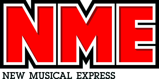
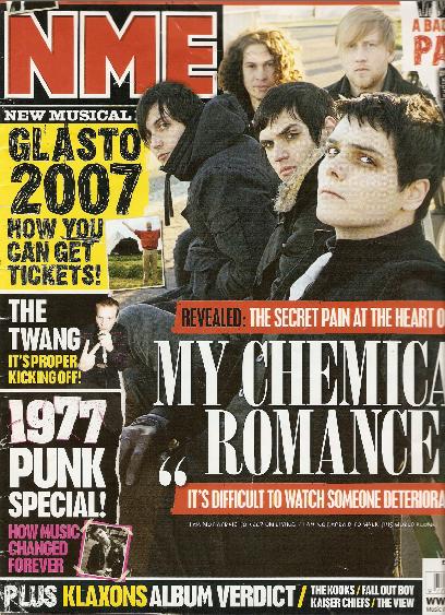
15th January 2012 - Masthead Designs
NME
Kerrang


Rolling Stone


With all three of these masthead designs the font is large and bold. They aren't too elaborate as to make them easy to read and recognise. The masthead is normally one of the largest fonts on the front cover, only second to maybe the title of the main article.
Kerrang
Rolling Stone
With all three of these masthead designs the font is large and bold. They aren't too elaborate as to make them easy to read and recognise. The masthead is normally one of the largest fonts on the front cover, only second to maybe the title of the main article.
Subscribe to:
Posts (Atom)